


 SHARE:
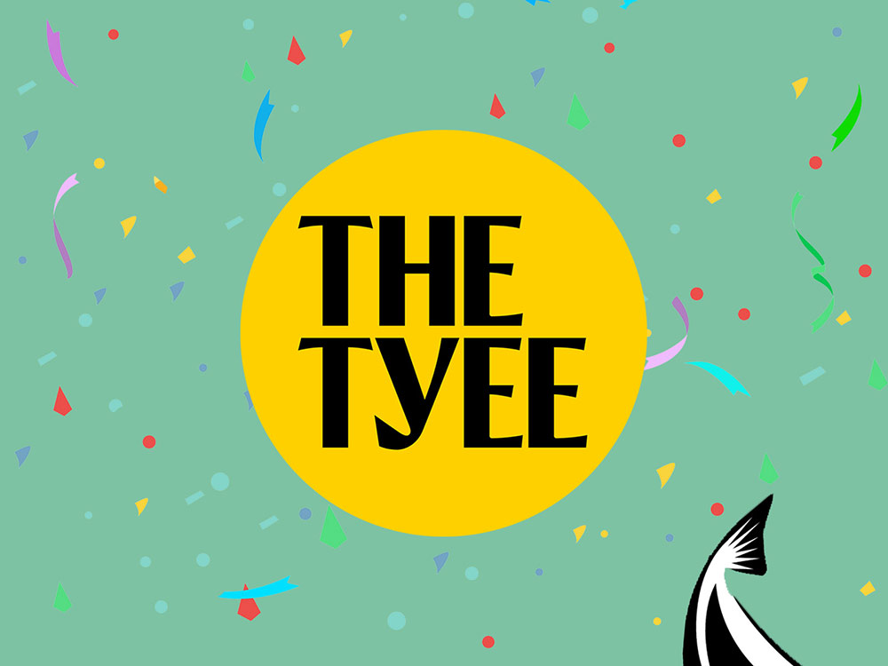
The Tyee changed its logo and look a few weeks ago. How did our community members respond? We asked and 308 chimed in.
Forty-four per cent of responses to the recent on-site poll said they loved the new look. Some 35 per cent liked our old design better and about 20 per cent said they weren’t sure.
Of course Tyee polls aren’t scientific. They’re snapshots of opinions readers choose to volunteer on various topics. In this case more were pro than con (whew!).
But we learned something else. Some of you really miss the fish — the mighty Chinook salmon that graced our previous logo. We’ve retired the fish out of respect to the Indigenous Peoples who created the word Tyee. But hey, let’s show it here once more for old time’s sake.

Here's the story of a reader's fond relation to the namesake:
In 1969, I moved from Alberta to work in a logging camp in Head Bay, on the west coast of Vancouver Island. The fishermen in the area often caught Tyee and remarked at how they were real scrappers fighting the line all the way to the boat. Whenever I see a picture of a Tyee, I am always reminded of how they could not be landed without a fight. About 12 years ago I stumbled across The Tyee online news and immediately knew that they had chosen the right symbol as their stories were usually seeking to giving back to the common good and highlighting the most vulnerable and marginalized in society.
And here are some ways readers mourned its passing:
The old logo is soooo West Coast.
The salmon image was B.C. iconic for me. Sad to see it swim into the sunset....
The salmon made the publication more down to earth. An identity that was more individual than the efficient modern corporate style layout. The reason people like me read The Tyee is because it is a local perspective of the world.
Please — I know the Y is a fish hook. I wish it were a fin, or, better yet, the old fish. I applaud your move to non-profit status, but minimalism is overrated. The overall look is bland.*
I really liked the previous graphic representation of a fish. The image had a quality of action in the way it was shaped, and on a subtle level brought my experience to one that was more than words, and of the senses. I like the current look too, its clean simplicity. Colours are close to the National Post.
I will miss the fish logo, an enduring symbol of our connection and dependence upon nature.
The fish was good and in the public’s mind was associated with a good journalism product. Its disappearance seems a mistake.
I like the fish. It is a symbol honoured through time by many cultures who held the fish in esteem for countless attributes which it represented to them, as seen in their art and myths. I don’t think that the new look has the same significance. The fish was what initially got my attention, which I only realized when it was suggested that it should go.
I’m sorry to see the fish go, but I like the nod to your heritage as seen in the stylised “Y.” You say it’s a fish hook — I think it looks like a fish tail, which is more humane. ;) *
I thought the fish tail, when I first saw it, was a little too cute — but have come to like it. What other publication could add a quirk like that to their masthead!
Some of you, on the other hand, were pleased we let loose our mascot:
Happy to see that fish off the hook!
I love that you have let that beautiful Tyee swim free — rather than kill it for some kind of trophy as they do in Campbell River!
Regarding the new logo and tweak of our fonts and page designs, some readers described the update as “clean” and “fresh.” Some said it looked less cluttered. And many credited the site’s improved readability, especially for people with vision issues, something that we were really thinking about when we started the redesign process.
Some of your feelings were, well, complicated:
I liked the old look. Somehow it suggested printer devils running to correct the mistakes of irascible typesetter and spilling pots of ink in the process.
I liked the old look just as one likes an old pair of jeans — comfy, familiar and easy to slip into. While the articles themselves have never been “comfy,” I felt safe with the old format.
At first I found it confusing but now I like it and am comfortable with it. Keep up the good work!
OMG OMG OMG OMG OMG OMG OMG OMG OMG OMG OMG OMG OMG OMG OMG OMG OMG OMG OMG OMG OMG OMG OMG oops OMG OMG OMG OMG OMG OMG OMG OMG OMG OMG
And, despite our efforts to accomplish the opposite, some found the new Tyee harder to read:
Thank you for your often excellent articles. As a retired man on old age security and guaranteed income supplements with glaucoma and other ills of aging to manage, I appreciate that I am allowed to read them without further distressing my already distressed wallet. The only thing I wish were different with your site is the size and colour of the text — it’s too small and faint for my glaucoma eyes. I know how to scale and colour the text, but I wonder how many others of my age do? Just a heads-up to young eyes.
Many just liked the old design better:
New look a little too spare. I liked the photos and the “warmer” look of old.
I think the layout and typefont is a bit bland and sterile.
Some of you really didn’t like the new design:
I hate the obnoxious yellow!! If your site had looked like this when I first discovered you I would probably not be a daily reader and donor today. I hope you didn’t pay your designer too much. You do such good work that I won’t leave but I’ll cringe every day.
Your new look must have been done by a high school dropout. It all looks the same and now I don’t particularly want to read anything in it. As the saying goes ‘If it ain’t broke, don’t fix it to something not as good.’ Please revert to the old look.
And some are reserving their judgements.
I will be 80 in a couple of months — I wish that so many things wouldn’t change so quickly — I almost figured out how to manage an update on my phone or desktop, when another update happens, and I have to learn that — it’s tiring and discouraging. Does the jolt really improve quality, or is it just change for the sake of change — time will tell I suppose.
I am open to the changes if you think they will achieve your goals. I do like the Y fish hook now that you’ve told me what it is.* Minimalist is good if it makes the content easier to read or more impactful. I wish you well with all endeavours.
Familiarity seems to be important for my aging mind. I will get used to it as long as it’s the same old excellent journalism.
I’m not liking it yet but I liked the old style a lot and maybe I just need to get used to this new format.
We’ll give the last words to a sample of our many readers who let us know they aren’t easily taken by looks.
What’s the point? Your work is very good! Keep at it.
It’s about the articles, eh? Don’t think about how you wrap the fish as long as the chips fall where they may.
* Editor's note: In the initial version of our poll, we referred to the “Y” in our logo as a fish hook, which some readers mentioned in their responses. It is indeed meant to be a fish tail. Swim free, Tyee! ![[Tyee]](/design-article.thetyee.ca/ui/img/yellowblob.png)
Read more: Media










Tyee Commenting Guidelines
Comments that violate guidelines risk being deleted, and violations may result in a temporary or permanent user ban. Maintain the spirit of good conversation to stay in the discussion.
*Please note The Tyee is not a forum for spreading misinformation about COVID-19, denying its existence or minimizing its risk to public health.
Do:
Do not: