

[Editor’s note: Use the player above to hear the article read by the reporter, The Tyee’s first version of an audio story to do so.]
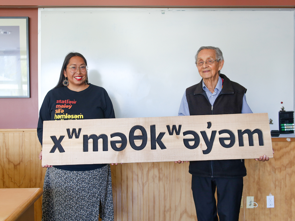
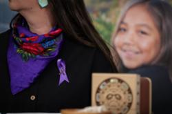
On the Musqueam reserve, Vanessa Campbell used to holler across the band office whenever she came across a character that wasn’t on the computer keyboard.
“How do I type a schwa?”
“Alt-four!” her boss would reply.
Over years of practice, Campbell has committed the key sequences to memory. She can now type her language using its 56 phonologically representative characters in full paragraphs.
Like many Musqueam babies, she grew up using the word “no” in the ancestral language.
But alongside a limited number of other words and phrases, that was all she was able to glean of what is now an endangered language. Her father and maternal grandparents were among the 150,000 Indigenous children forcibly assimilated at residential schools throughout Canada’s history, alienated from their cultures.
In Campbell’s early life, the language was not commonly spoken on the reserve, which borders Vancouver’s southwest. But by the time she entered high school, revitalization efforts were underway, and a course was available for graduation credits. Thinking it would be easy, she signed up.
“My dad didn’t think I would need it for anything in life, which made it kind of hard to do homework,” said Campbell.
But she and the other Musqueam teenagers helped each other out. Together in a makeshift classroom in the Elders centre on the reserve, this young generation learned how to speak, read and write.
Campbell enjoyed the experience so much that she continued working with the language after graduation. She wrote tests, tutored students and transcribed archival tapes of fluent speakers of the past. Campbell, now 36, is the program assistant at the band’s language department.
Like most Indigenous languages, the Musqueam language was historically transmitted orally. After years of developing a writing system, known as orthography, the Musqueam adopted the North American Phonetic Alphabet in 1997. The system can accurately represent the sounds of the 36-consonant language not present in English, sounds that the Latin alphabet fumbles at representing.
NAPA enabled the community to engage in the documentation of their language and build resources to revitalize it.
But as a user of an Indigenous language in a typographical world with keyboards and encoding systems dominated by English, Campbell would run into an everyday but overlooked problem.
How to type the language with ease? How to stop it from getting garbled across devices, with inaccurate characters or awkward placements? How to create digital tools to preserve and evolve a language endangered by colonization?
The sovereignty of type
Leo Vicenti, an assistant professor of communication design at Emily Carr University of Art + Design and an enrolled member of the Jicarilla Apache Nation, says that the importance of orthography and typefaces developed in collaboration with Indigenous groups shouldn’t be ignored or downplayed as a means of expression and self-determination.
“It’s an expression of visual sovereignty to have a distinct look and feel,” said Vicenti, “to have an orthography developed by an Indigenous community, and then to have a custom typeface made to support that orthography.”
Early writing systems for Indigenous languages were largely developed by missionary settlers and anthropologists, without the consultation and collaboration with Indigenous communities critical to moving forward language revitalization we see today. These were predominantly represented by syllabic systems, which use symbols to represent entire syllables, like those developed by missionaries for Inuktitut and Cree.
It wasn’t until the 20th century that Indigenous groups largely started mapping their languages with characters that could fully represent the breadth of their sound systems. And with the advent of computers, groups like Musqueam could use more characters outside of the Latin alphabet to represent the sounds of their language. But the downside of this is a lack of typefaces.
When Vicenti became a designer, he remembers coming across typefaces for English that were "primitive" perceptions of Indigenous cultural motifs, with arrows and geometric shapes.
Missing were typefaces that could display the characters adopted for Indigenous languages. “There’s not a lot of people who do this work,” he said.
Despite how crucial it is to have a typography that can effectively represent the language, typefaces and fonts can have a bit of a geeky reputation to people who aren’t designers.
“It’s definitely difficult to create excitement around it,” said Campbell.
The ease with which people can type a language affects how widely it is used. However, anthropologists and linguists have noted that the lack of digital services and support for Indigenous languages is part of their continued marginalization. The ability to display characters used in Indigenous languages across programs and devices — which exists for languages as different as Chinese and Russian — is key to language revitalization, from communication to the sharing of educational materials.
In their absence, typefaces optimized to be primarily used for English — a language without accents or diacritics — mean errors and restrictions abound.
Out of character
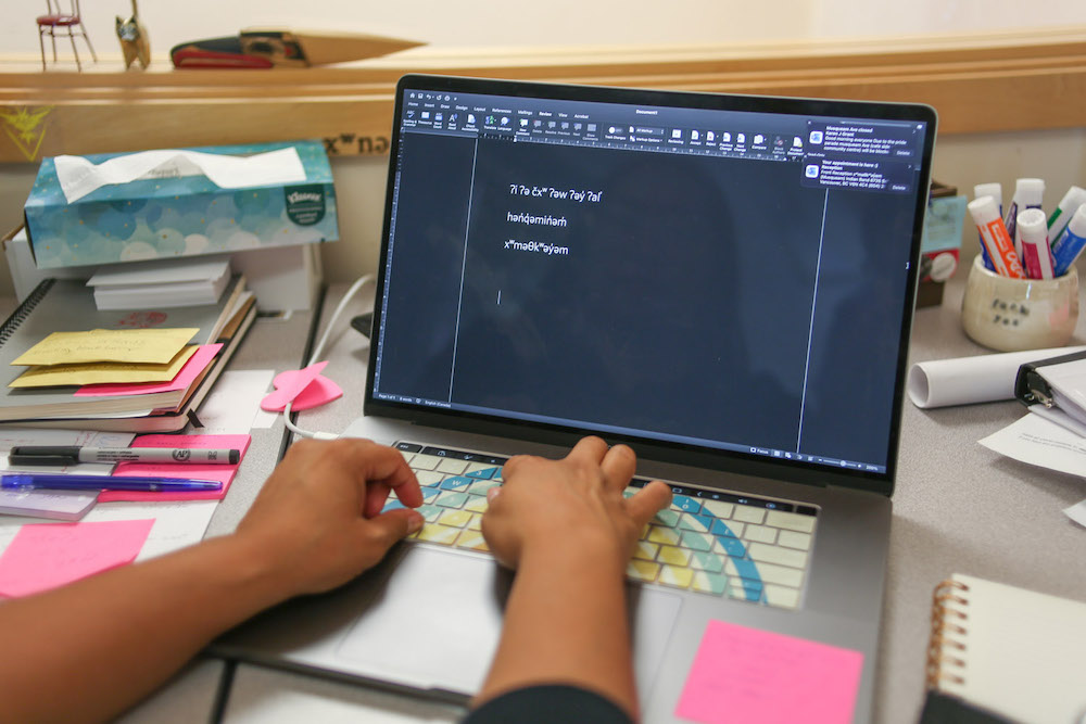
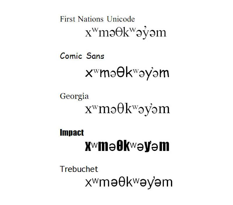
The name of the Musqueam language is hən̓q̓əmin̓əm̓.
You’ll notice that Tiempos, the typeface that we use at The Tyee in various weights, isn’t able to display the name hən̓q̓əmin̓əm̓ properly. While the “h” and “mi” are in Tiempos, the rest of the characters are automatically substituted with what’s called a "fallback" typeface that can display them.
The two typefaces in use have different heights for their characters, resulting in a bigger “h” and “mi” that look like they’re awkwardly popping out at you.
These inconsistencies are common when someone unfamiliar with the Musqueam alphabet is oblivious to how it should look.
Before NAPA, the band relied mostly on the English alphabet because that allowed it to be typed on a typewriter, leading to mispronunciations being carried forward.
This is why the work of Campbell and others who listen to recordings of fluent speakers is so important.
Even the spelling of the name “Musqueam” is an old anglicization that the community is gradually beginning to phase out. Unlike English, where characters often stand in for a variety of different sounds, the current alphabet accurately represents the historical pronunciation: xʷməθkʷəy̓əm. The biggest difference to Campbell is the “x,” an airy sound, accompanied by the superscript “ʷ,” which is an instruction to round your lips. Also, the “s” in the anglicized spelling Musqueam is represented in the new alphabet by theta, or θ, a Greek letter used in phonetic alphabets akin to the “th” sound in the word “thing.”
The lack of Indigenous language typefaces isn’t a problem that English users often think about because they are able to display text in over 130,000 existing typefaces without issue. For Musqueam, there was only one typeface they could find that displayed all of their language’s characters: First Nations Unicode.
The typeface, which closely resembles Times New Roman, was developed by the University of British Columbia’s First Nations and Endangered Languages program and can be downloaded for free use. Because Windows computers were unable to display the typeface when it was released, Musqueam used Macs and still does to this day.
A double-edged word
Being a language with only one effective typeface had its limitations.
It meant that the language could never be bolded like most computer typefaces, as the designer of First Nations Unicode never created characters in a heavier style.
It meant that the language could only ever be expressed in one visual voice, with no differing styles between the everyday world of emails, the casual fun of memes and the grand lettering of signs and publishing.
It meant that sharing text with external parties often had to be done with images and PDFs, because the characters wouldn’t transfer smoothly if the receiver didn’t have First Nations Unicode.
It meant that designers who insisted on displaying the language in a typeface other than First Nations Unicode would use the wrong characters to make it work. For example, using an “a” or “u” in place of the “ə” schwa.
It meant that a mobile keyboard app like FirstVoices, that says it is able to display all Indigenous languages in Canada, is unfamiliar with Musqueam’s uniqueness. The app is tempting to use because it can display almost all of the language’s characters. But there are differences like the absence of the Musqueam’s belted “l” (ɬ) in favour of an l with a bar, also known as a dark “l” (ƚ). Campbell doesn’t recommend the app to her community because “history will remember” the wrong “l” as a result.
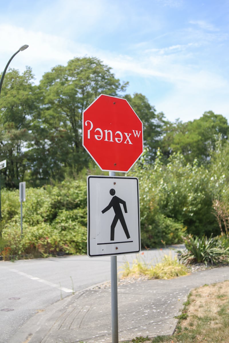
As local reconciliation efforts began to ramp up about a decade ago, Campbell began to see her language more and more in published materials, but it wasn’t always correct. She once spotted a word in the language on a big bus ad, but the designer, instead of the “ʔ” glottal stop, used a question mark. The word was also capitalized, when Musqueam does not use capitals.
“It’s a double-edged sword to see a word that you recognize out there in the world, but so sad that it isn’t correct,” she said. “To anyone else, it looks like jumbly garbage.”
Letter by letter
How to give more options to languages like Musqueam’s when custom typefaces are expensive and time-consuming to design?
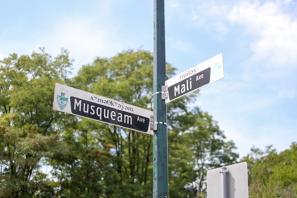
The University of British Columbia has been increasingly using the language over the years in publications and public spaces, as it is on the traditional, ancestral and unceded territory of the Musqueam people.
But in order to display the language correctly in the university’s typefaces, design manager Matt Warburton of the brand and marketing team had to work with Campbell and the Musqueam language department.
In 2014, Warburton made minor tweaks to a typeface called Huronia so that it could accurately display the diacritics — the accents that accompany letters — used by Musqueam. The typeface had different weights, a first for Musqueam.
“We could see it in bold!” said Campbell. “It could be the header of a page or a sign, and it would still be pretty.”
However, the university’s institutional typeface was more challenging because many of the characters that Musqueam used were missing. Called Whitney, the typeface was originally developed for the Whitney Museum in New York.
“I would just draw it,” said Warburton. “We wanted it to look the way it should, to look professional, to look respectful. I had this file full of characters and accents. It was fine for the work I was doing, with different signs and plaques. It was easy to plug them in.”
Whitney was very different from what Campbell and other Musqueam language users were used to seeing. It’s a sans serif — the same style as well-known typefaces like Arial and Helvetica. That means it doesn’t have serifs, the little strokes at the end of letterforms that make the characters more ornate, like those you see in typefaces like Times New Roman. Serifs originated from Greek and Roman antiquity when letters were chiselled into stone. Without those decorations, sans serif typefaces appear more minimal and modern.
For five years, Warburton designed characters in Whitney as they were needed. It got to a point where they couldn’t help but ask: “How can we make this into a usable version?”
“With most brand environments, you will carefully choose a typeface that brings that brand to life, a voice that reflects the values and principles,” said Warburton. “You’re using Times New Roman — and there are some brands that use it quite effectively — and that’s not the look or the voice that you want to have, then it is limiting.”
In 2019, the team embarked on creating new characters within the Whitney typeface that could fully display the languages of the two peoples whose ancestral and unceded lands the university resides on: Musqueam for Vancouver and Syilx for the Okanagan campus.
The design was no longer ad hoc for a specific project, said Campbell. “It was letter by letter, so we could have this new font to use at our discretion for anything.”Representing a language in a typeface is a communal effort. For four years, Warburton and the Musqueam language department passed suggestions to Tiro Typeworks, a digital type foundry, to design.
They scrutinized each character and each weight of each character. They tested words and paragraphs, to ensure that the characters were properly sized and wouldn’t result in diacritics crashing into one another. Tiro also coded the characters so that they could be typed on standard keyboards.
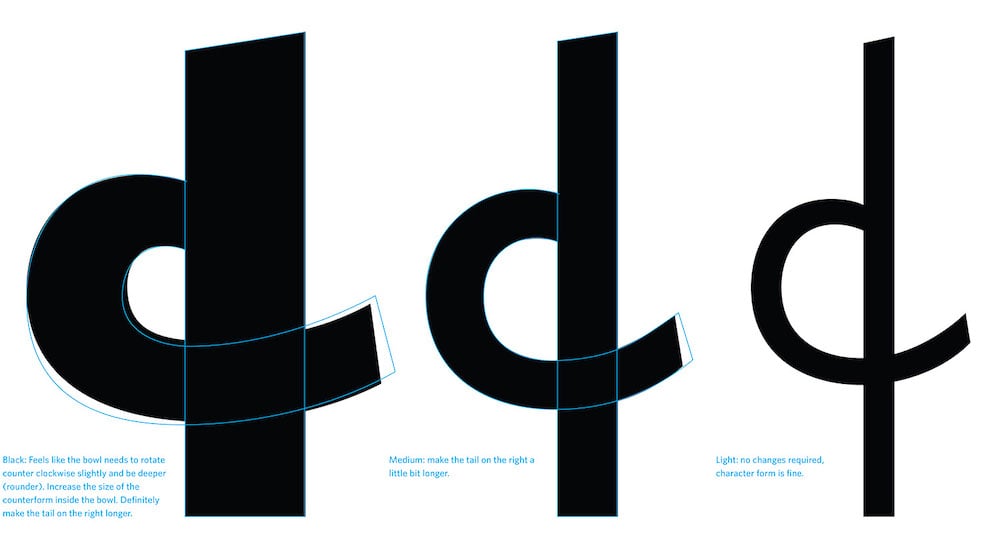
After four years of work, Whitney Salishan was completed, named after the Salishan family of Indigenous languages of the Pacific Northwest to which hən̓q̓əmin̓əm̓ belongs. Because of how expensive custom typefaces can be, it was the product of rare collaboration, and the type can now be spotted across the campuses on signs and buildings.
“It’s really indicative of the need to do this kind of work not only in B.C., but across Canada, to be more respectful of the fact that these languages have long existed,” said Warburton.
Learning to read
As part of reconciliation efforts, there is increased introduction and reintroduction of Indigenous language names in places like British Columbia — which has a very colonial name itself — to remind people of the history.
However, there remain settlers who take one look at writing systems like Musqueam’s and complain about not being able to read it. Never mind the fact that they represent another language altogether.
In 2018, the City of Vancouver gave the north plaza of the Vancouver Art Gallery a new name in the Musqueam and Squamish languages, publishing a video to teach viewers its spelling and pronunciation.
The comments section is filled with remarks from English speakers about the language being spoken too fast and how Indigenous languages are not “official” in Canada. “Are you serious Vancouver?” reads one comment [sic]. “I get that it’s first nation land and all that, but what the hell? Just name it something simple that everyone can pronouce for crying out loud.”
“One of the questions we get all the time is, ‘Can you spell that word phonetically?'” said Campbell.
The question is ironic because the Musqueam language is spelled with characters that consistently represent phonemes — distinct units of sound — a far cry from English spelling. The NAPA system is commonly used in English dictionaries and with English language learners. What those people don’t realize they’re trying to ask for instead is for the language to be written only with letters used in English, which would result in makeshift pronunciations assimilated to it.
Phonetic systems used to be more common, taught in public schools. Elder Larry Grant, 87, the interim manager of the language department, learned such notation growing up on Vancouver’s east side in the neighbourhood of Strathcona.
“It was the immigrant district and there were kids from every walk of life, every ethnic group,” said Grant. “They were teaching it to us to read and pronounce English.”
Both Campbell and Grant believe phonetics should be part of a public education.
“I think we work hard to gently remind people that it’s not respectful to anglicize a word or phrase in a language so that you’re able to pronounce it,” said Campbell. “The respectful thing is to learn.”
Just the right type
Don’t underestimate typography, says professor Vicenti. Remember, the work is all part of sovereignty and self-determination.
“A typeface can really change a culture,” he said. “Language is like a vessel. All the knowledge and those worldviews are carried within that language. So to offer or to allow the language to flourish in its natural forms, to immerse or be able to immerse people in it, to be able to reflect the culture in our daily lives, to be able to offer language programs, to be able to write books and publications — all of those are transformational services. It could be the difference between a culture dying or a culture surviving.”
Interest in the subject is growing. Last year, Vicenti spoke at Ezhishin, the first conference on Indigenous North American typography, launched to further dialogue on the subject and encourage Indigenous designers to create typefaces in their own languages.
Musqueam is one of six communities that speak hən̓q̓əmin̓əm̓. It is part of what’s called a dialect continuum, alongside Halq̓eméylem, spoken upriver, and Hul̓q̓umín̓um̓, mostly spoken on Vancouver Island. While there are language teachers in all six hən̓q̓əmin̓əm̓-speaking communities, none have fluent speakers.
But now, at family dinners, Campbell and her siblings are teaching their father new words they’ve learned. He has no trouble with the pronunciation.
“Over 15 years ago, my dad just didn’t care about hən̓q̓əmin̓əm̓,” she said. “Now, it’s something that brings him joy. That’s one of the things that language does for communities: it helps break down the trauma our parents’ generation suffered from residential schools.”
Typography has a special role to play as the language is beginning to be accommodated in new places after a history of neglect. On documents, computers and Microsoft Teams, Whitney Salishan is making an appearance.
UBC has a limited number of licenses for the expanded typeface, which are available to Musqueam, Syilx and faculty. The university is working with Monotype, the company that holds the copyrights to the Whitney typeface, to make it available to the public for purchase.
Around the time the Whitney Salishan project was launched, another post-secondary designed the characters to display hən̓q̓əmin̓əm̓ in its institutional typeface too. Langara College also worked with Campbell and the language department to display the hən̓q̓əmin̓əm̓ name that Musqueam gave to the institution, “house of teachings,” in its typeface Adelle.
While these typefaces are a step forward for the language, UBC’s Whitney and Langara’s Adelle are existing typefaces. The next step, says Campbell, would be for the community to create a brand new typeface from scratch.
“I feel like the community understands it’s important to express hən̓q̓əmin̓əm̓ digitally in different ways,” she said. “I would hope that the community feels like it’s ready to be in a place to design something of our own that’s completely custom.”
Until then, she’s enjoying new expressions of the language that weren’t around when she was a student.
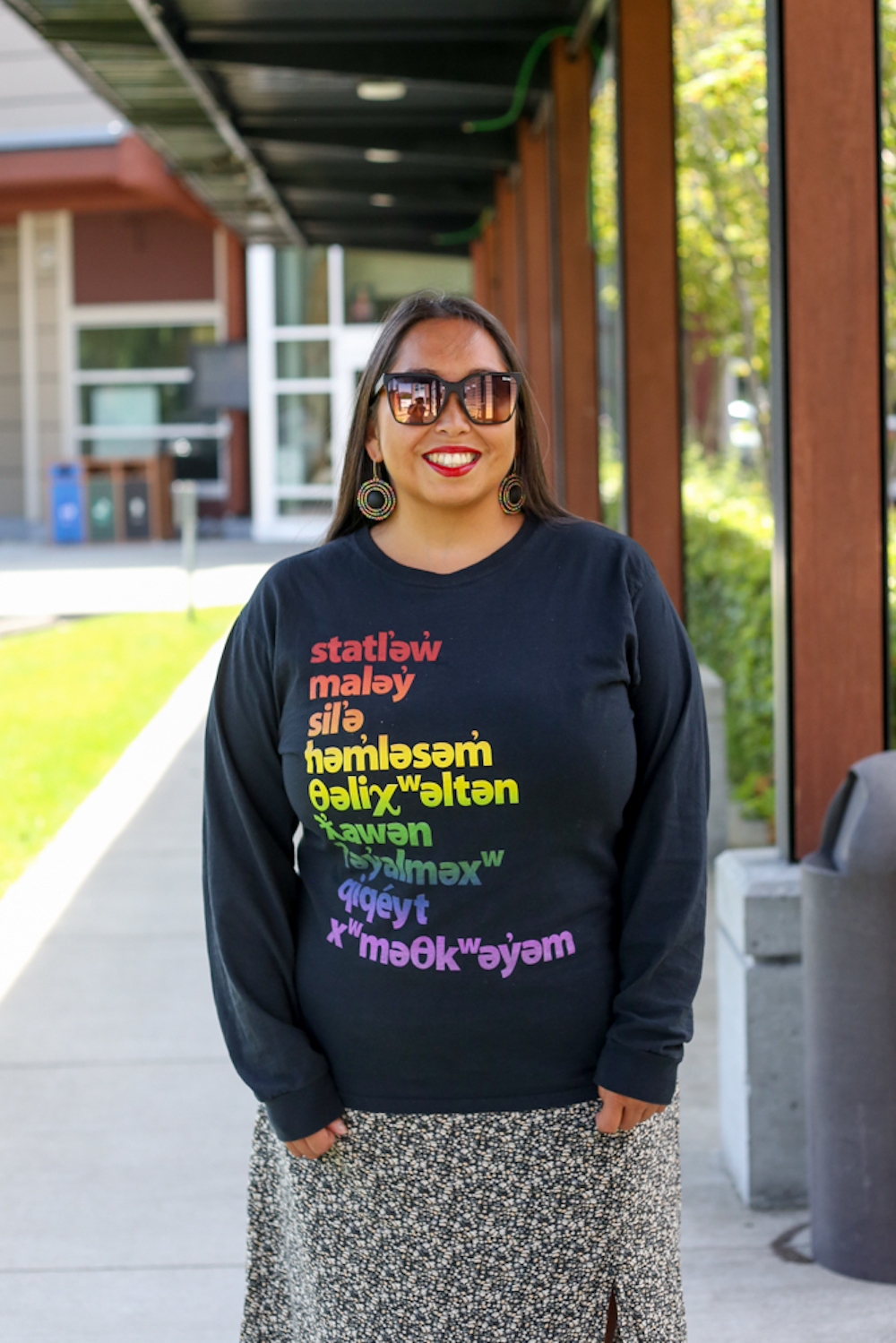
Her friends in the community have used Whitney Salishan to make memes in hən̓q̓əmin̓əm̓. On her phone, she has inputted hən̓q̓əmin̓əm̓ phrases like “happy birthday” into the dictionary for easy recall. She also sports a T-shirt with the reserve’s hən̓q̓əmin̓əm̓ street names, set in yet another sans-serif new to the language, thanks to the company Welcome to Eastvan for taking the time to display the characters properly.
“It’s just so exciting to me that this is all part of a multifaceted revitalization effort,” she said. “When every character has the same weight, when it hits the line at the same spot and you can tell it’s a word in a language, it feels so heartwarming.” ![]()
Read more: Indigenous, Education, Media


Tyee Commenting Guidelines
Comments that violate guidelines risk being deleted, and violations may result in a temporary or permanent user ban. Maintain the spirit of good conversation to stay in the discussion and be patient with moderators. Comments are reviewed regularly but not in real time.
Do:
Do not: